CLIENT:Mimico Lacrosse
SERVICES:Brand Typography
The Ask
Mimico Lacrosse wanted to Expand Their Brand using typography that would resonate with their heritage dating back to 1890, communicate their competitive edge, and engage their community. They sought to preserve the nostalgic essence of their brand while infusing modern elements that could carry their identity forward.
The Challenge
The primary challenge was to blend the historical aspects of the brand with a contemporary look and feel. It was crucial to select typefaces that would not only reflect the club's storied past but also appeal to a diverse audience, from young athletes to longtime supporters. Additionally, the typography needed to function across various platforms, from print to digital, and maintain legibility and impact at every scale.
The Design
We curated a suite of four typefaces that harmonize nostalgia with modernity, individuality with unity, and formality with approachability. Each font was chosen to not only stand on its own but also to complement the others, creating a layered and cohesive brand identity. The resulting typographic strategy enables Mimico Lacrosse to tell their story with authenticity and engage with their audience in a meaningful way.
Cooper Black serves as the primary display font, providing a bold and impactful presence that commands attention. Its rounded contours exude a sense of approachability, making it ideal for engaging the community and invoking a sense of nostalgia linked to the club’s history, especially when reflecting on the retro logo from the 1980s.
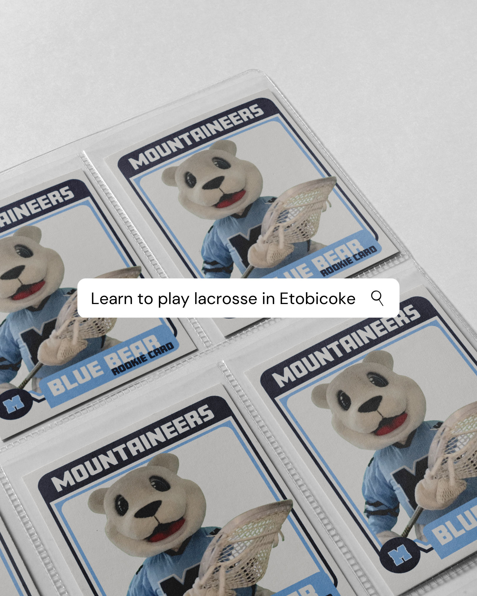
Draft Night is selected as the secondary display font, aligning with the competitive spirit of the club’s programs. With sharp, clean lines and a collegiate feel, it imparts a sense of athleticism suitable for headers and subheads where clarity and a strong visual hierarchy are essential. Its modern touch correlates well with the club’s current monogram logo, creating a bridge between past and present.
GT Walsheim Pro is chosen for body copy due to its friendly yet precise character. It provides excellent readability for longer texts, ensuring that messages are conveyed clearly without visual strain. The font's modern and professional look maintains a balance between being approachable and ensuring the brand’s communications are taken seriously.
Quotes Script is an accent font, offering a personal touch. It is utilized sparingly to draw attention to headers, callouts, or to emphasize key phrases.
Brand Touchpoints
By leveraging the typefaces across various brand touchpoints, we've ensured that each interaction with the brand reinforces its visual identity.
The retro logo was front and centre in the club's throwback apparel line. For example in this photo the phrase "It's Great to Be a Mountaineer" encircles a retro illustration of the club’s mascot in the Draft Night font. The use of brand typography ensures that club apparel is easily recognizable.
On the website, Cooper Black is central in the presentation of local community programs. This typeface, known for its friendly and rounded features, offers a sense of approachability and playfulness, aligning perfectly with the community-centric ethos of the club's programs.
Cooper Black also helps to differentiate the local programs from the more competitive aspects of the club. Here, Cooper Black is a strategic choice to invoke a sense of inclusivity and fun, reflecting the club’s desire to be seen as a community hub where everyone, regardless of age or skill level, is invited to join and enjoy the sport.


